
 By Culture Expert
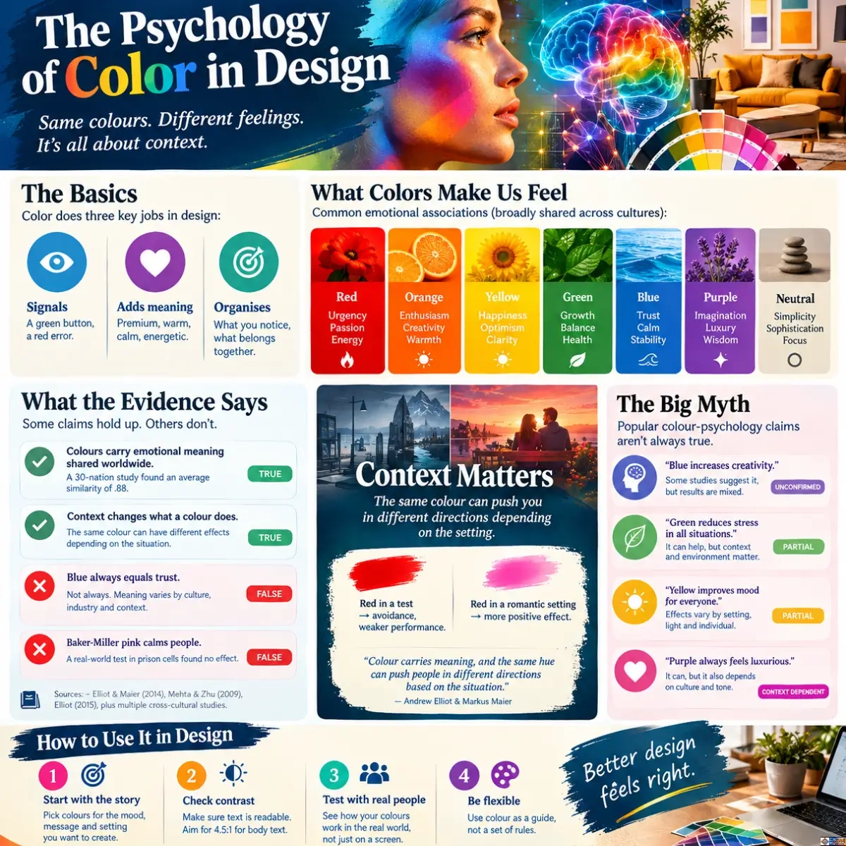
Search for a palette and the verdicts arrive fast. Blue means trust. Red means urgency. Green means growth. Yellow means happy. Tidy, quotable, and, from what I’ve read in the research, mostly too neat to be true.
Here’s the pain I think most designers and homeowners feel and rarely admit. You follow the rules, and the result still feels wrong. The bank-blue logo that looks like every other bank. The “calming” grey-green living room that reads like a dentist’s waiting area. The checkout button in urgent red that nobody can quite read at a glance. You did what the cheat sheet said. So why does it feel off?
Because the cheat sheet skipped the hard part. The power of colour in design is real, but it runs on context, culture and contrast, not on one-word meanings. This guide sorts what the evidence supports from what it doesn’t. Culture Mosaic covers design through heritage and history, which suits the subject, since The Psychology of Color in Design is half biology and half biography. For the graphic-design basics first, this design-school primer on The Psychology of Color in Design is a handy starting point.
I haven’t run my own survey or interviews for this piece, and I won’t pretend otherwise. What I have done is trace every claim to a published source, and run one analysis myself: the contrast calculations in section 6. Everything is sourced at the bottom.
1. Why Is Color Important in Design? It Carries Meaning and Steers Attention
Start with the plain answer. Colour matters in design because it does three jobs at once. It signals: a green button, a red error. It attaches meaning: this brand feels premium, that kitchen feels warm. And it organises: what you look at first, what belongs together. There’s no opting out. Even a greyscale design is a colour decision. That’s the starting point for the psychology of color in design: no choice is ever neutral.
The most useful framework I know comes from psychologists Andrew Elliot and Markus Maier. Their colour-in-context theory says colour carries meaning, and the same hue can push people in different directions depending on the situation (Elliot & Maier, 2014). In lab experiments, a glimpse of red before an achievement task was linked to avoidance motivation and weaker performance (Elliot et al., 2007). Move red into a romantic setting and the effect shifts (Meier et al., 2012). Same colour. Different story.
Elliot’s own 2015 review describes the field as still young, and I’d take that seriously. Some findings are solid. Others are single-paper surprises. Mehta and Zhu (2009) reported in Science that red backgrounds helped detail-focused tasks while blue helped creative ones. Intriguing. I’d still treat an effect that tidy as a hypothesis until someone reproduces it in your own setting.
So which popular claims survive? Here’s my scorecard for the ones people repeat most.
Table 1. Popular colour-psychology claims, scored against published evidence
| Claim | What the evidence shows | Verdict |
|---|---|---|
| Colours carry emotional meaning shared worldwide | 4,598 people in 30 nations showed highly similar colour-emotion patterns (average r = .88), with local differences on top (Jonauskaite et al., 2020). | Strong |
| Red pushes people toward avoidance | Found in lab achievement tasks, but it flips with context (Elliot et al., 2007; Meier et al., 2012). | Real, context-dependent |
| Workplace colour affects mood | 988 workers in four countries: light and colour influenced mood; measured brightness alone did not (Küller et al., 2006). | Moderate |
| Baker-Miller pink calms aggression | 59 male prisoners in Swiss detention: no difference between pink and other cells (Genschow et al., 2015). | Not supported |
| Colour drives 62–90% of snap judgments | Widely repeated. As far as I can trace, it comes from a marketing article (Singh, 2006), not a controlled experiment. | Unverified |
2. What Is Carl Jung’s Color Theory? And What Did Kurt Goldstein Actually Find?
Two names surface in nearly every search on this topic: Carl Jung and Kurt Goldstein. Both get oversold.
Jung never published a standalone colour theory. What exists is scattered across lecture remarks and symbolic writing, stitched together by later readers. The version people quote ties four colours to his four psychological functions. Blue for thinking, which he linked to air and spirit. Red for feeling, because of blood and the heart. Green for sensation, because the earth’s surface is green. Yellow, sometimes white or gold, for intuition, because it radiates like the sun. In his alchemical studies he also followed a four-stage sequence of black, white, yellow and red. It’s a rich symbolic language. It is not an experiment. I’d use it as a lens for storytelling and mood boards, never as a personality test or a design rule.
Goldstein is a different animal, and a more interesting one. A German-born neurologist and psychiatrist, he published “Some Experimental Observations Concerning the Influence of Colors on the Function of the Organism” in Occupational Therapy and Rehabilitation in 1942. He reported that patients with brain disease moved, judged and perceived differently under red than under green, with accuracy and stimulus thresholds shifting in opposite directions (Goldstein, 1942).
Then comes the line designers skip. Goldstein wrote that colour’s influence is stronger in neurotic and psychotic patients. These were clinical observations of people with specific conditions, made with 1940s methods. Treating them as proof that red walls make healthy adults anxious is a leap I wouldn’t take. Useful ideas. Thin evidence for your living room.
3. Colour Meaning Changes Across Cultures and Centuries
Here’s the finding that surprised me most, because it cuts against both camps. Colour-emotion links look more universal than cultural-relativist arguments predict. An international team tested 4,598 people from 30 nations, speaking 22 languages, asking them to match 20 emotions with 12 colour terms. The patterns were strikingly alike across countries, with an average similarity of .88. Yet nation still predicted answers beyond that shared core, and countries close in language or geography agreed more (Jonauskaite et al., 2020).
Think of it as a shared floor with local furniture on top. The floor is probably biology and common experience: sky, blood, foliage, fire. The furniture is ritual, trade and politics. And history keeps rearranging the furniture. That mix is the core of the psychology of color in design.
White is the classic case. Queen Victoria wore white at her 1840 wedding, and the V&A notes her choice was as much about practicality and patriotism, showing off British lace, as about purity. A fashion moment became a UK default. Purple tells a similar story. A 1574 proclamation restricted purple silk to the royal family, though Shakespeare’s Globe points out there is little evidence the rule was enforced. Law and price made purple royal. Not psychology.
Table 2. One colour, different meanings: how context rewrites the message
| Colour | One context | Another context | What changed |
|---|---|---|---|
White | UK weddings: the bridal norm after Queen Victoria’s 1840 white dress (V&A). | A funeral and mourning colour in several East Asian traditions (widely documented; check the specific culture). | Ritual use, not wavelength, carries the meaning. |
Red | Danger and error signal in many interfaces; avoidance cue in test settings (Elliot et al., 2007). | Traditional bridal and festive colour in China and India (widely documented); a romance cue in some experiments (Meier et al., 2012). | Context decides. |
Purple | Reserved for English royalty by a 1574 proclamation (Shakespeare’s Globe). | A luxury shorthand in modern packaging (a convention, not a law). | Dye cost created the status. |
Blue | Costly ultramarine, sometimes pricier than gold, marked sacred figures in European painting (National Gallery). | The default “safe” brand colour in finance and tech (a convention, not a law). | Scarcity then, ubiquity now. |
4. Colour in Historical Art and Architecture Followed the Money
Pigment prices explain more colour symbolism than psychology does. Natural ultramarine came from lapis lazuli mined in Badakhshan, in present-day Afghanistan, and the National Gallery notes it has sometimes cost even more than gold. Patrons often paid for the exact amount they wanted in the picture, which is one reason sacred figures wear blue. Meaning followed money.
Taste follows fashion too. According to the National Gallery’s colour podcast, Sassoferrato’s The Virgin in Prayer was overpainted in cobalt blue when the museum first acquired it, to suit a Victorian preference for a more muted look. Even a masterpiece’s colour got “corrected” to match what one century preferred.
Writers kept circling the same question. Goethe’s Theory of Colours (1810) was an early attempt to link colour with feeling, and Elliot traces modern theorising back to it. Johannes Itten carried the idea into the Bauhaus classroom. Josef Albers later showed in Interaction of Color (1963) that a colour changes depending on its neighbours. For the wider question of why certain painters become household names, see Culture Mosaic’s Who Is the Most Famous Artist? Surface matters as well. Thick, tactile paint throws tiny shadows that shift how a hue reads, a point worth following up in tactile abstract art techniques.
5. Interior Colour Design and Well-being: Light Matters as Much as Paint
Walk into a room and your brain doesn’t consult a chart. It reads light first, colour second, memory third. Color psychology in interior design gets sold as paint-chip magic. The data is more modest, and more interesting.
Küller and colleagues studied 988 people in real workplaces across four countries. The light and colour of the workplace itself influenced mood. The surprise: mood peaked when people experienced the lighting as “just right”, while measured illuminance on its own showed no significant effect. Perception beat the light meter. Good colour design, the authors suggest, can contribute to a more positive mood (Küller et al., 2006). Note the careful verb. Can contribute. Not will fix.
Now the pink cell. In 1979 a naval correctional facility in Seattle painted a holding cell Baker-Miller pink, and the idea spread to other institutions. Decades later, Genschow and colleagues tested it on 59 male prisoners in Swiss detention. Aggression fell over three days in every cell, but there was no difference between pink and the others. The team even warned that pink could feel humiliating to inmates (Genschow et al., 2015; BPS Research Digest, 2014). I love it as a cautionary tale: a lovely hypothesis that travelled faster than its evidence.
What about neuro-aesthetics, the science of how brains respond to designed spaces? Culture Mosaic’s guide to Neuro-Aesthetic Wall Art walks through the research on nature imagery, curved forms and moderate visual complexity, and it’s blunt that no single painting rewires your brain. For palettes borrowed from living things, try biophilic folk art aesthetics. For rooms that lean on restraint instead of hue, tactile minimalism art techniques shows how texture can do the work. And to explore your own reactions, the colour-journaling exercise in art therapy power of artistic expressions is simple: put colours to moods on a blank page.
Three practical checks before you commit to a wall. Test swatches at 8 a.m. and again at 9 p.m., because daylight and lamplight rewrite paint. Photograph the room and convert it to greyscale; if everything collapses into one grey, you lack contrast. Live with a sample board for a week. And the odd one: tape a printed copy of your palette inside the fridge door for a few days. You’ll see it half-asleep and unperformed, which is as honest as a reaction gets. That’s a hunch of mine, not a study.
6. Color Psychology in UI, Logo Design and Branding: Folklore vs Facts
Branding is where colour psychology gets the most hype and the least rigour. Labrecque and Milne (2012) did find that colour shapes how people perceive a brand’s personality: red reads exciting, blue reads competent. That’s useful. It is not the same as “blue builds trust”. And the statistic everyone quotes, that colour drives 62 to 90 per cent of snap judgments, traces back to a marketing article (Singh, 2006) as far as I can tell, not a controlled test. I’d keep it out of any client deck.
Interfaces are different, because the failure is measurable. Contrast is the one part of colour you can calculate. I ran the WCAG relative-luminance formula on nine text and background pairs.
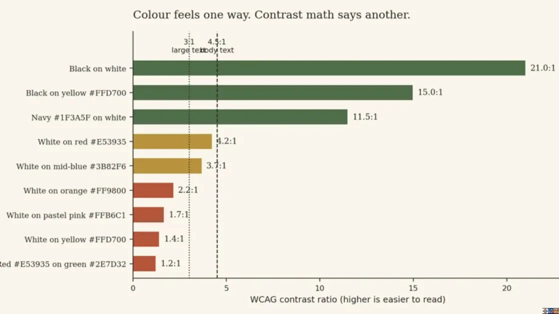
Figure 1. Original analysis: WCAG contrast ratios for nine common text and background pairs (calculated for this article)
White text on yellow lands at 1.4:1. On pastel pink, 1.65:1. White on a common alert red (#E53935) reaches 4.23:1, missing the 4.5:1 that WCAG asks of body text by a whisker (W3C, 2023). Red on green? 1.21:1, and that is before colour vision enters the picture. Around 1 in 12 men and 1 in 200 women have a colour vision deficiency, which means roughly 3 million people in Britain (Colour Blind Awareness; UK Government Design102, 2019). Colour can’t be your only signal. Add an icon, a label, a pattern.
Colour psychology in character design
Film is the cleanest laboratory for colour as shorthand. Pixar’s Inside Out gave each emotion a signature hue: yellow Joy, blue Sadness, red Anger, green Disgust, purple Fear. That’s a design convention, not a scientific claim, and it works because the film teaches you the code early, then trades on it. The lesson travels well to graphic design and branding. Teach the audience what a colour means in your world, then stay consistent.
My rule for applying the psychology of color in design, whatever the medium: choose colour for the story you’re telling, verify it for contrast, then test it on real humans. In that order.
7. What Two Colors Should Not Be Seen Together? Probably Fewer Than You Think
No pair is banned. Anyone who says red and blue must never meet is selling superstition. What’s true is narrower. Trouble starts when two colours share similar lightness, so their shared edge seems to shimmer, a phenomenon Josef Albers explored in Interaction of Color (1963). It starts when a pairing erases information for people with colour vision deficiency. And it starts when saturated hues, such as red text on blue, create an unsettling depth illusion called chromostereopsis. Red on green trips the first two at once, which is why my calculation came out at a miserable 1.21:1.
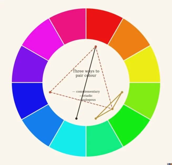
Figure 2. Three classic ways to pair colours on a 12-step wheel (original diagram)
Complementary pairs sit opposite each other on the wheel. Triads form a triangle. Analogous colours sit side by side. Analogous schemes feel calm, complementary ones feel punchy, and triads sit somewhere between. But safe can turn dull, and clash is sometimes the point. Collage artists use it deliberately; see fragmented collage with visible seams for what happens when the joins stay visible.
Your Palette Deserves a Test, Not a Rule
Pick one live project this week. A logo, a landing page, a bedroom wall. Write down the feeling you want in one plain sentence. Not “modern and trustworthy”. Something with texture, like “quiet, a bit warm, not clinical”.
Then choose colours for that sentence. Check the contrast numbers. Show the result to five people who don’t know what you intended and ask what they feel. If their words match yours, carry on. If not, you’ve saved yourself a costly repaint or a flat launch. The psychology of color in design rewards testing far more than memorising.
Skip the test and the palette still goes live. It just goes live on luck. I’d rather not leave a client’s first impression, or a wall you’ll stare at for years, to chance. Culture Mosaic keeps unpicking how heritage, craft and design shape each other, so if this helped, there’s plenty more where it came from.
Colour never did the persuading on its own. People did, with their memories, their money and their history soaked into every swatch.
Frequently Asked Questions
1. What is the psychology of color in design?
The psychology of color in design is the study of how hue, brightness and saturation influence what people feel, notice and do when they look at a designed object, space or screen. Research shows broadly shared colour-emotion associations across 30 nations, plus strong effects of context and culture. It guides decisions in branding, interiors, interfaces and character design, but it offers tendencies, not guarantees.
2. What is Carl Jung’s color theory?
Jung didn’t publish a single colour theory. His lecture remarks and symbolic writing link four colours to his four psychological functions: blue to thinking, red to feeling, green to sensation, and yellow, sometimes white or gold, to intuition. In alchemical studies he also traced a black, white, yellow and red sequence. It’s a symbolic framework for storytelling and reflection, not an experimentally validated design rule.
3. What is Kurt Goldstein’s color theory?
Goldstein was a neurologist who reported in 1942 that patients with brain disease moved, judged weights and perceived stimuli differently under red and green light. He wrote that colour’s influence is stronger in neurotic and psychotic patients. His observations are clinical, small-scale and historical, so claims that red walls make healthy people tense go well beyond what he showed.
4. What two colors should not be seen together?
No pair is banned. Problems arise when colours share similar lightness, which makes edges shimmer, when the pair is hard to tell apart for people with colour vision deficiency (about 1 in 12 men and 1 in 200 women), or when saturated hues create a depth illusion. In my contrast calculations, red on green scored just 1.21:1, far below the 4.5:1 guideline for body text.
5. Why is color important in design?
Colour signals what to do, attaches meaning to brands and spaces, and organises attention and hierarchy. It also affects accessibility, because contrast decides whether people can read your content. Evidence suggests colour can influence mood and perception, though effects depend on context and culture, so test your palette with real users rather than relying on fixed rules.
Sources and Further Reading
Albers, J. (1963). Interaction of Color. Yale University Press.
BPS Research Digest (2014). Are prisoners calmer when their cells are painted pink? https://digest.bps.org.uk/2014/12/02/are-prisoners-calmer-when-their-cells-are-painted-pink
Colour Blind Awareness. What is colour blindness? (UK charity; figures: about 1 in 12 men, 1 in 200 women, around 3 million people in Britain).
Design102, UK Government (2019). Today is Colour Blind Awareness Day: how aware are you? https://design102.blog.gov.uk/2019/09/06/today-is-colour-blind-awareness-day-how-aware-are-you/
Elliot, A. J. (2015). Color and psychological functioning: a review of theoretical and empirical work. Frontiers in Psychology, 6, 368. https://www.frontiersin.org/articles/10.3389/fpsyg.2015.00368/pdf
Elliot, A. J., & Maier, M. A. (2014). Color psychology: effects of perceiving color on psychological functioning in humans. Annual Review of Psychology, 65, 95–120.
Elliot, A. J., Maier, M. A., Moller, A. C., Friedman, R., & Meinhardt, J. (2007). Color and psychological functioning: the effect of red on performance attainment. Journal of Experimental Psychology: General, 136(1), 154–168.
Forest Homes Store. Neuro-Aesthetic Wall Art (biophilic interior design and neuro-aesthetics; a retailer’s blog, so read as a commercial perspective). https://www.foresthomesstore.com/blogs/decor-for-wellbeing/biophilic-interior-design-designing-with-neuro-aesthetics-for-a-stress-free-home
Genschow, O., Noll, T., Wänke, M., & Gersbach, R. (2015). Does Baker-Miller pink reduce aggression in prison detention cells? A critical empirical examination. Psychology, Crime & Law, 21(5), 482–489.
Goethe, J. W. von (1810). Zur Farbenlehre (Theory of Colours).
Goldstein, K. (1942). Some experimental observations concerning the influence of colors on the function of the organism. Occupational Therapy and Rehabilitation, 21(3), 147–151. https://www.Gwern.net/doc/psychology/vision/1942-goldstein.pdf
Itten, J. (1961). The Art of Color. Reinhold.
Jonauskaite, D., Abu-Akel, A., Dael, N., et al. (2020). Universal patterns in color-emotion associations are further shaped by linguistic and geographic proximity. Psychological Science, 31(10), 1245–1260. https://doi.org/10.1177/0956797620948810
Jung, C. G. (1921/1971). Psychological Types, Collected Works vol. 6. Princeton University Press. (Jung’s remarks pairing colours with the four functions come from lecture material, including his ETH Zurich lectures; a secondary compilation was used to check the pairings, and the primary volumes should be consulted before quoting.)
Küller, R., Ballal, S., Laike, T., Mikellides, B., & Tonello, G. (2006). The impact of light and colour on psychological mood: a cross-cultural study of indoor work environments. Ergonomics, 49(14), 1496–1507.
Labrecque, L. I., & Milne, G. R. (2012). Exciting red and competent blue: the importance of color in marketing. Journal of the Academy of Marketing Science, 40(5), 711–727.
Mehta, R., & Zhu, R. (2009). Blue or red? Exploring the effect of color on cognitive task performances. Science, 323(5918), 1226–1229.
Meier, B. P., D’Agostino, P. R., Elliot, A. J., Maier, M. A., & Wilkowski, B. M. (2012). Color in context: psychological context moderates the influence of red on approach- and avoidance-motivated behavior. PLoS ONE, 7(7), e40333. https://pmc.ncbi.nlm.nih.gov/articles/PMC3394796
National Gallery, London. The Wilton Diptych: ultramarine. https://artsandculture.google.com/story/zAXh8ZSniJOqhA
National Gallery, London. Colour Stories: Blue (podcast). https://www.nationalgallery.org.uk/podcast/colour-stories-blue
Platt College. The Psychology of Color in Design (graphic-design primer). https://platt.edu/blog/psychology-color-graphic-design/
Shakespeare’s Globe (2019). Elizabethan sumptuary laws: fashion policing in Shakespeare’s England. https://www.shakespearesglobe.com/discover/blogs-and-features/2019/04/16/elizabethan-sumptuary-laws-fashion-policing-in-shakespeares-england/
Singh, S. (2006). Impact of color on marketing. Management Decision, 44(6), 783–789.
Victoria and Albert Museum. The Victoria connection (white wedding dress). https://www.vam.ac.uk/articles/the-victoria-connection
W3C (2023). Web Content Accessibility Guidelines (WCAG) 2.2, success criteria 1.4.1 and 1.4.3. https://www.w3.org/TR/WCAG22/