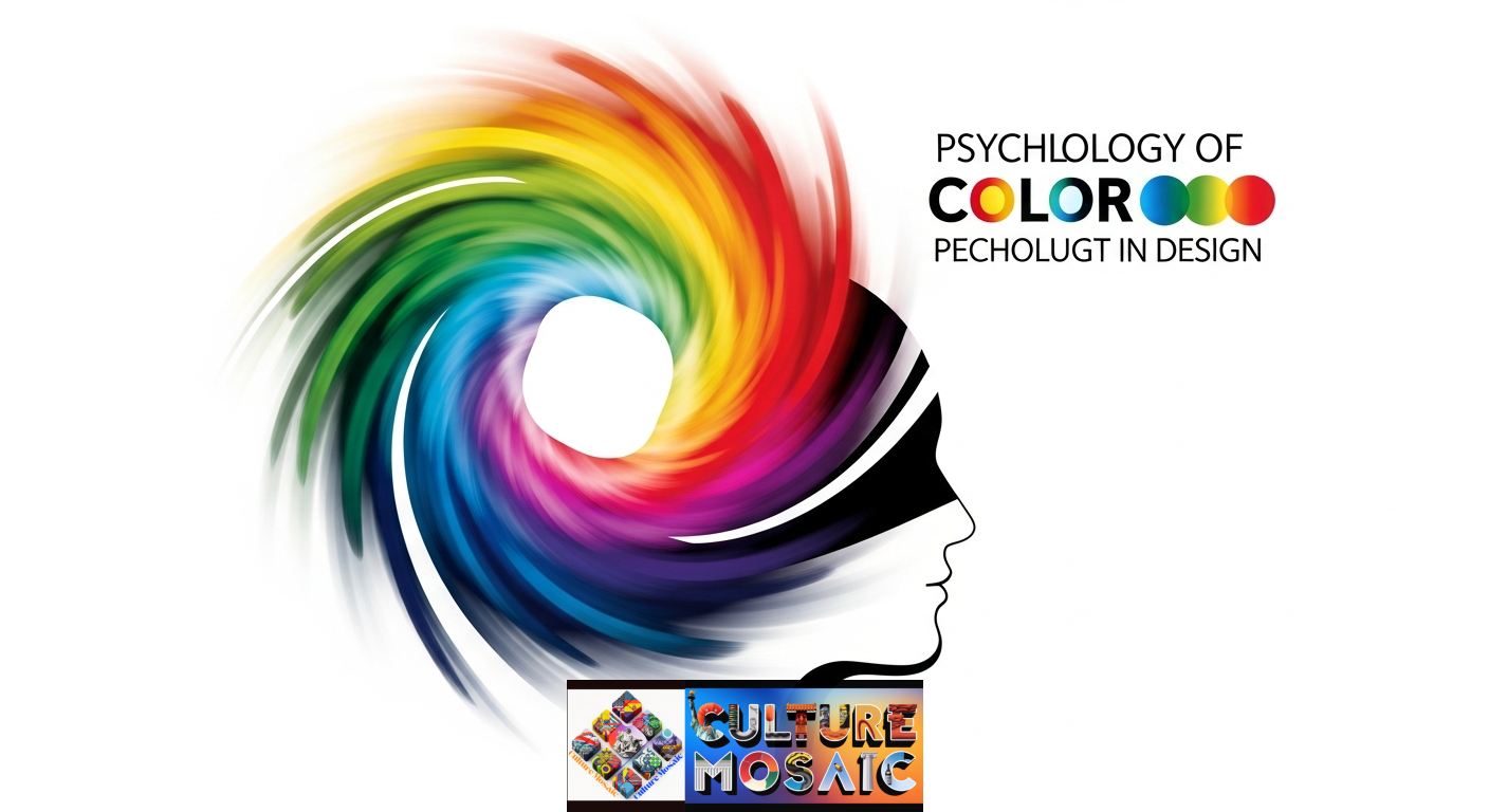
Color isn’t just decoration. It’s communication. When you choose a shade for your website, logo, or product packaging, you’re making a psychological statement that influences how people think, feel, and act.
Understanding the psychology of color in design gives you a powerful advantage. While your competitors guess at color choices based on personal preference, you’ll be making informed decisions grounded in human behavior and perception.
This guide breaks down everything you need to know about how color affects the human mind and how to use that knowledge in your design work.
What Is the Psychology of Color in Design?
The psychology of color in design refers to how different hues trigger specific emotional and behavioral responses in viewers. It’s the intersection of neuroscience, cultural conditioning, and visual perception.
When light hits your retina, your brain doesn’t just register “blue” or “red.” It activates networks of associations built from millions of years of evolution and decades of personal experience. Blue reminds us of clear skies and calm water. Red signals danger, passion, or ripe fruit.
Smart designers leverage these hardwired responses to guide user behavior, build brand identity, and create memorable visual experiences.
Understanding Color Theory Basics
Before diving into psychological applications, you need to grasp the fundamentals. Understanding the psychology of color in design starts with classic color theory.
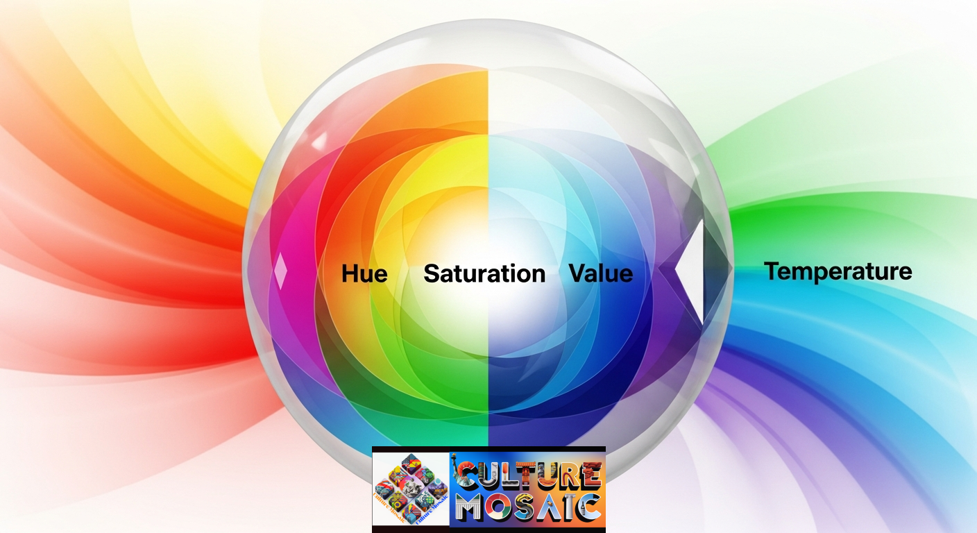
The Core Elements
Hue is what most people mean when they say “color.” It’s the pure pigment: red, blue, yellow, green.
Saturation measures intensity. A highly saturated red screams for attention. A desaturated red (closer to gray) feels subdued and sophisticated.
Value refers to lightness or darkness. Navy blue and sky blue share the same hue but have dramatically different psychological impacts because of their value.
Temperature splits color into two families: warm hues (reds, oranges, yellows) and cool hues (blues, greens, purples). Warm colors advance visually and feel energizing. Cool colors recede and feel calming.
These four properties combine to create the psychological fingerprint of every color you use.
The Emotional Impact of Individual Colors

Each color carries distinct psychological associations. Here’s what research and practice reveal about the psychology of color in design for specific hues.
Blue: Trust and Tranquility
Blue is the most universally liked color across cultures. It lowers heart rate and blood pressure, creating feelings of calm and security.
That’s why you see blue everywhere in corporate design. Banks, insurance companies, and tech giants use blue to signal stability and trustworthiness—Facebook, Twitter, LinkedIn, and PayPal all feature blue prominently in their branding.
In design applications, lighter blues work well for healthcare and wellness brands. Darker navy blues convey professionalism and authority.
Red: Urgency and Passion
Red accelerates heart rate and creates a sense of urgency. It’s the color of blood, fire, and ripe fruit, triggering both excitement and alertness.
Retailers strategically use red in clearance sales and “buy now” buttons to prompt immediate action. Netflix, YouTube, and Coca-Cola harness red’s energy to create bold, memorable brands.
But red requires careful handling. Too much feels aggressive or overwhelming. In design, use red as an accent to drive specific actions, not as a dominant background color.
Yellow: Optimism with Caution
Yellow is the brightest color in the visible spectrum. It grabs attention instantly and evokes feelings of happiness, warmth, and optimism.
McDonald’s and IKEA pair yellow with red or blue to create welcoming, energetic brand experiences. The combination makes their spaces feel both cheerful and approachable.
However, yellow has a dark side. High-saturation yellow can trigger anxiety and eyestrain. It’s also associated with caution (traffic lights, warning signs). Use it sparingly and balance it with grounding colors.
Green: Growth and Balance
Green sits in the middle of the color spectrum, making it the most restful color for the human eye. It represents nature, growth, health, and renewal.
Whole Foods, Starbucks, and Animal Planet use green to emphasize their connection to natural, sustainable, or healthy values. In financial contexts, green signals prosperity and wealth (think dollar bills).
For design applications, green works beautifully for environmental brands, wellness products, and financial services. It creates balance without being boring.
Purple: Luxury and Creativity
Purple has historically been expensive to produce, making it the color of royalty and luxury. It combines the stability of blue with the energy of red, creating a sense of mystery and sophistication.
Hallmark, Cadbury, and Yahoo use purple to stand out in crowded markets. It appeals to creative, imaginative audiences and works well for beauty, luxury, and artistic brands.
Lighter purples (lavender, lilac) feel more feminine and calming. Deeper purples (plum, eggplant) feel more luxurious and dramatic.
Orange: Friendliness and Energy
Orange combines red’s energy with yellow’s cheerfulness. It feels approachable, affordable, and fun without being as aggressive as pure red.
Home Depot, Nickelodeon, and Fanta use orange to create friendly, accessible brands. It’s particularly effective for companies targeting families or younger demographics.
In web design, orange converts well for call-to-action buttons. It stands out without triggering the psychological resistance that red sometimes creates.
Black: Sophistication and Power
Black isn’t technically a color, but it carries enormous psychological weight. It represents power, elegance, sophistication, and modernity.
Luxury brands like Chanel, Prada, and Nike use black to signal premium quality and timeless style. In tech, black suggests sleek innovation (think Apple’s product photography).
However, black can also feel heavy, oppressive, or morbid if overused. Balance it with white space or bright accent colors to maintain visual interest.
White: Simplicity and Purity
White represents cleanliness, simplicity, and innocence. It’s the foundation of minimalist design and creates breathing room in busy layouts.
Tech companies like Apple use abundant white space to make their products feel modern and sophisticated. Healthcare brands use white to emphasize cleanliness and sterility.
Pure white can feel cold or clinical in some contexts. Warmer off-whites (cream, ivory) feel more welcoming and organic.
How Major Brands Apply the Psychology of Color in Design
Real-world examples show the psychology of color in design in action. Let’s examine how successful US companies use color strategically.
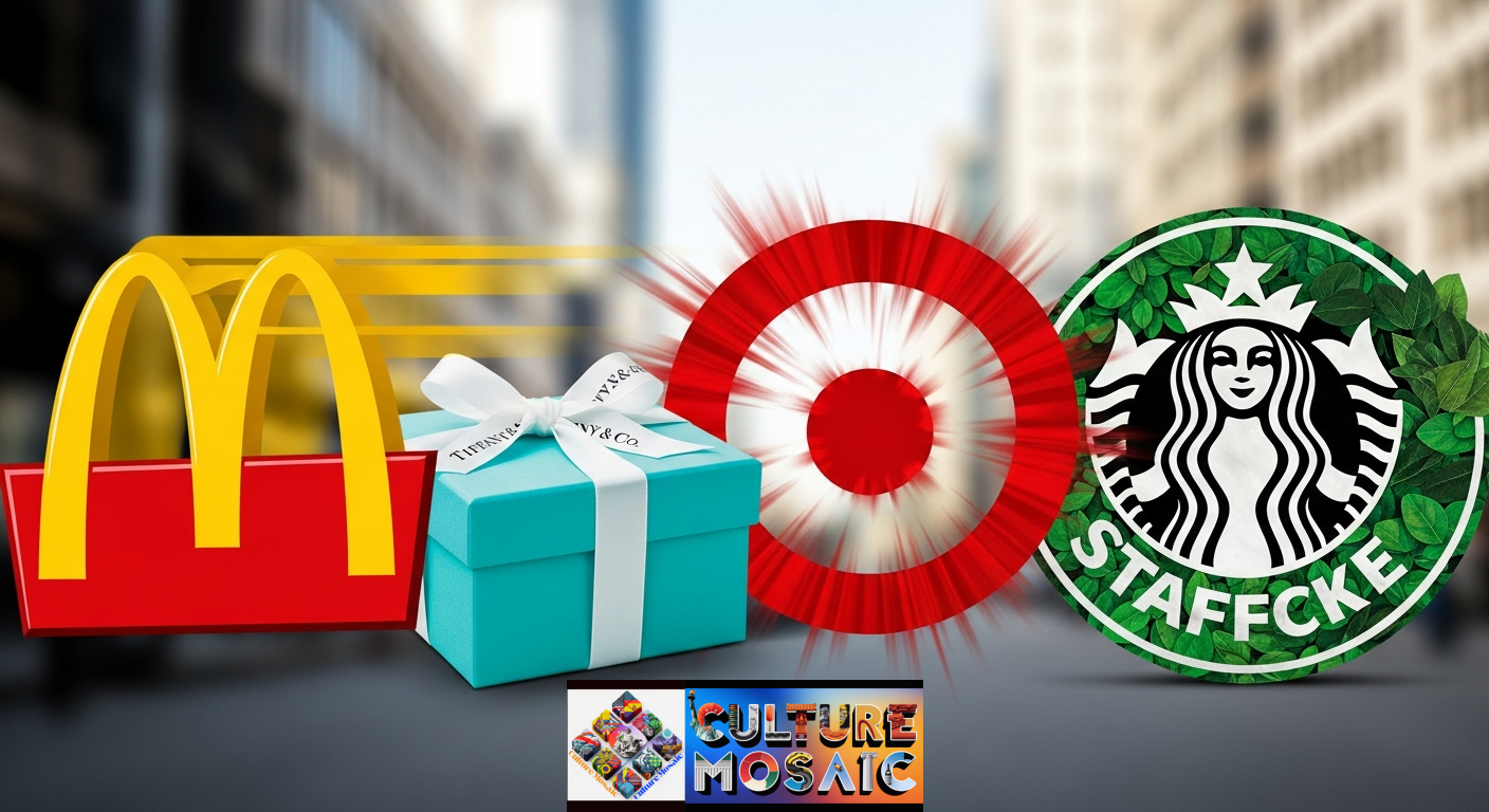
McDonald’s: Red and Yellow for Speed
McDonald’s combines red (urgency) with yellow (happiness) to create an environment that feels welcoming but doesn’t encourage lingering. Research suggests these colors actually make people eat faster and leave sooner, increasing table turnover.
Tiffany & Co.: Signature Blue for Exclusivity
Tiffany’s trademarked robin s-egg blue creates instant recognition and luxury associations. The specific shade is so distinctive that seeing it triggers emotional responses even without the brand name.
Target: Red for Energy and Value
Target uses red to create excitement around shopping while positioning itself as more upscale than Walmart (which uses blue for trust and low prices). The bulls-eye logo turns red urgency into a friendly, approachable target.
Starbucks: Green for Community
Starbucks evolved from brown to green as it grew from a coffee bean retailer to a “third place” community hub. Green reinforces its commitment to ethical sourcing and environmental responsibility.
These case studies demonstrate that the psychology of color in design directly impacts purchasing decisions and brand perception.
Cultural Context: Color Meaning Isn’t Universal
The Psychology of Color in Design: While some color associations are biological (red increases heart rate), many are culturally learned. Effective application of the psychology of color in design requires understanding your specific audience.
Color Variations Across US Subcultures
In mainstream US culture, white represents purity and weddings. But in many Asian-American communities, white is associated with death and mourning. Purple signals royalty in Western contexts but can represent death in some South American cultures.
Even within the United States, color preferences vary by region, age, and demographic group. Younger audiences often prefer brighter, more saturated colors. Older, affluent audiences tend toward muted, sophisticated palettes.
Global Influences in a Connected Market
As US markets become increasingly multicultural, designers must consider multiple cultural contexts simultaneously. A color choice that resonates with one demographic might alienate another.
Research your target audience thoroughly. What colors appear in their existing environment? What cultural associations might they bring to your design? Test your color choices with representative users before finalizing.
Practical Applications: Using Color Psychology in Your Design Work
Theory means nothing without application. Here’s how to apply the psychology of color in design to specific design challenges.
Choosing Brand Colors
Start with your brand values and target emotions. Do you want to feel trustworthy? Use blue. Energetic and bold? Try red or orange. Natural and healthy? Choose green.
Create a mood board with competitor colors to ensure differentiation. You don’t want to blend into your market.
Consider a primary color (60% of your design), secondary color (30%), and accent color (10%). This creates hierarchy and prevents visual chaos.
Designing Effective Calls to Action
Your CTA button color should contrast sharply with your background while aligning with your desired user emotion. Orange and green typically convert well because they feel positive and actionable without triggering resistance.
A/B test different colors with real users. Small changes in hue or saturation can create surprisingly large differences in click-through rates.
Creating Color Harmony
Use the color wheel to create pleasing combinations:
Complementary colors (opposites on the wheel) create high contrast and energy. Think blue and orange, or purple and yellow: temperature splits color into two families—warm hues (reds, oranges, yellows) and cool hues (blues, greens, purples).
Analogous colors (neighbors on the wheel) create harmony and flow. Think blue, blue-green, and green.
Triadic colors (evenly spaced on the wheel) create balanced, vibrant designs. Think red, yellow, and blue.
Accessibility Considerations
The psychology of color in design must account for color blindness and visual impairments. About 8% of men and 0.5% of women have some form of color vision deficiency.
Never rely solely on color to convey information. Use text labels, patterns, or icons as backup. Check your contrast ratios using WCAG guidelines (4.5:1 for normal text, 3:1 for large text).
Tools and Resources for Color Psychology in Design
Modern tools make applying the psychology of color in design faster and more effective.
Color Palette Generators
Coolors generates harmonious color schemes instantly. Hit the spacebar to cycle through options until something clicks.
Adobe Color (formerly Kuler) lets you create palettes based on color harmony rules and extract colors from uploaded images.
Paletton shows you how your colors look in realistic design contexts, including how they appear to people with different types of color blindness.
Psychology-Focused Resources
Color Psychology by Eva Heller provides research-backed insights into cultural color associations across different countries.
The Secret Lives of Color by Kassia St. Clair explores the historical and psychological stories behind specific pigments.
Designing Brand Identity by Alina Wheeler includes extensive sections on strategic color selection for brand development.
Testing and Validation Tools
UsabilityHub lets you run five-second tests to measure emotional response to your color choices.
Optimizely and Google Optimize enable A/B testing of different color variations to measure real-world performance.
WebAIM’s Contrast Checker ensures your color combinations meet accessibility standards.
These tools help you move from color theory to practical application quickly.
Common Mistakes to Avoid
Even experienced designers make these errors when applying the psychology of color in design.
Following Trends Blindly
Millennial pink and Gen Z yellow had their moments, but trend-chasing makes your brand feel dated quickly. Choose colors that align with your specific brand values, not what’s popular on Instagram this month.
Ignoring Context
A color that works beautifully for a fitness brand might fail for a law firm. Always consider your industry, audience, and competitive landscape.
Using Too Many Colors
More isn’t better. Limit yourself to three or four colors maximum in any single design. Too much variety creates visual confusion and dilutes your message.
Forgetting About Backgrounds
A color that looks great on white might disappear on gray. Always test your colors against all the backgrounds where they’ll appear.
Assuming Universal Meaning
Don’t assume your personal color associations are universal. Test with real users from your target demographic.
The Future of Color Psychology in Design
The psychology of color in design continues evolving as technology and culture shift.
Dynamic Color Systems
More brands are adopting color systems that shift based on context, time of day, or user mood. Spotify’s dynamic color extraction from album artwork creates personalized experiences.
Accessibility-First Design
As awareness grows, designers are prioritizing accessible color choices from the start rather than treating them as an afterthought.
Cultural Sophistication
Global brands are creating localized color strategies that respect cultural differences while maintaining brand consistency.
Data-Driven Decisions
Machine learning tools can now analyze how color choices perform across different demographics and contexts, making color selection more scientific than ever.
Conclusion: Color as a Strategic Advantage
The psychology of color in design gives you a powerful tool for influencing perception and behavior. Every hue you choose sends a message, triggers an emotion, and shapes how people interact with your work.
Start with solid color theory fundamentals. Understand the emotional associations of different colors. Consider your specific audience and cultural context. Use proven tools to generate and test your choices. Avoid common mistakes that dilute your impact.
Most importantly, remember that color psychology isn’t about manipulation. It’s about communication. When you align your color choices with your authentic brand values and audience needs, you create designs that feel right because they are right.
The brands that stand out aren’t always the loudest or brightest. They’re the ones that use color strategically, intentionally, and authentically. Now you know how to join them.
FAQs About The Psychology of Color in Design
What is the most psychologically powerful color in design?
No single color is universally most powerful. Red creates the strongest physiological response (increased heart rate), but blue is most universally trusted. The most powerful color for your specific design depends on your goals, audience, and context. Choose based on the emotion you want to trigger, not abstract rankings.
How many colors should I use in a design project?
Limit yourself to three or four colors maximum: one primary color (60% of your design), one secondary color (30%), one or two accent colors (10%). This creates a visual hierarchy without overwhelming viewers. More colors create confusion and dilute your psychological impact.
Do color psychology principles work the same way globally?
No. While some associations are biological (red increasing alertness), most color meanings are culturally learned. White means purity in Western cultures but mourning in many Asian cultures. Always research your specific target audience’s cultural background before finalizing color choices.
Can color psychology increase conversion rates?
Yes. Studies show that changing call-to-action button colors can increase conversions by 20% or more. However, the “best” color depends on your specific design, audience, and brand context. What succeeds for one organization may falter for another. Always A/B test color changes with your real users.
How do I choose colors for my brand if I’m color blind?
Use objective tools like contrast checkers and accessibility validators rather than relying on your perception alone. Consult with team members or designers who have full color vision. Focus on contrast and hierarchy rather than specific hues. Remember that 8% of men are color blind, too, so designing for accessibility benefits both you and your users.